Identifying Printing Techniques and Paper Types in Vintage Periodicals

This guide provides the technical knowledge required to identify printing methods and paper stocks used in vintage periodicals. Understanding these physical characteristics helps collectors determine a magazine's age, production quality, and potential market value. We'll look at how to spot letterpress, offset lithography, and various paper weights to distinguish a high-end collector's item from a standard newsprint issue.
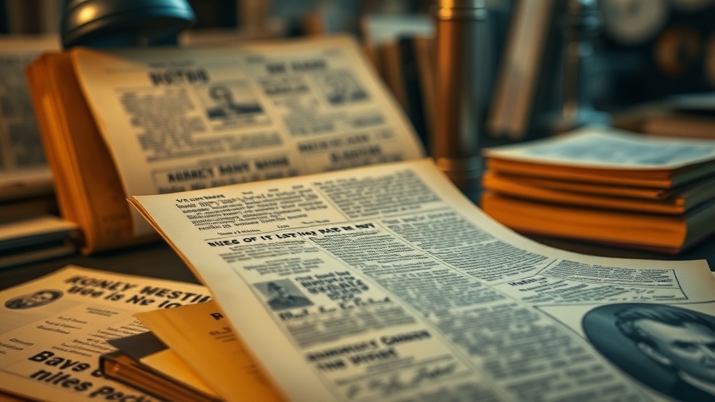
How can you tell the difference between letterpress and offset printing?
The easiest way to distinguish between letterpress and offset printing is by looking for physical indentation or "debossing" on the paper. Letterpress is an older method where a raised metal type or plate is pressed directly into the sheet, leaving a tactile impression. If you run your fingers over the text and feel a slight dip—especially on heavy cardstock covers—you're likely looking at a letterpress or relief print.
Offset lithography, which became the standard for many mid-century publications, uses a flat plate and chemical properties to transfer ink. There is no physical indentation with offset. If the surface feels perfectly smooth and the ink sits on top of the fibers rather than being pressed into them, it's likely an offset print. This method is much faster and cheaper, which is why it dominates the mass-market magazine-sphere from the 1960s onward.
You might also notice "halftone dots" under a magnifying glass. These tiny dots of cyan, magenta, yellow, and black (CMYK) are the hallmark of modern offset processes. While some older high-end magazines used halftone screen technology to create images, the clarity of the dots tells a story about the machine used.
- Letterpress: Tactile, heavy ink coverage, slight indentation of text.
- Offset Lithography: Smooth surface, consistent dot patterns, high-speed production feel.
- Gravure: Often found in high-gloss mid-century magazines; features a very deep, rich ink look that can sometimes feel slightly textured.
Don't be fooled by high-quality scans online. A digital image can't show you the physical texture of the ink. You need to see the actual physical object to be certain.
What does the paper type tell you about a magazine's era?
Paper type is a direct indicator of a publication's budget, target audience, and the technological era in which it was produced. A high-end fashion magazine like Vogue from the 1950s will feel fundamentally different from a weekly news publication like Life from the same decade.
Newsprint is the most common paper for high-circulation, low-cost periodicals. It's highly absorbent, thin, and contains high amounts of wood pulp. Because it isn't chemically treated to be acid-free, newsprint turns yellow and brittle over time. This is a natural aging process. If you're holding a 1940s issue of a local weekly, expect it to be fragile. If you're looking at pinpointing the value in vintage magazines, the condition of the paper is often the first thing a buyer notices.
On the other hand, "coated" or "glossy" paper was a major advancement. This involves a thin layer of clay or polymer applied to the surface to make it smoother and more reflective. This allowed for sharper color images and prevented ink from soaking too deeply into the fibers. You'll see this more frequently in the 1970s and 1980s as printing technology became more accessible. It makes the colors pop, but it also makes the paper more susceptible to "finger oils" and moisture damage.
| Paper Type | Typical Use | Aging Characteristic |
|---|---|---|
| Newsprint | Weekly news, low-budget journals | Yellowing, brittle, high acidity |
| Uncoated/Matte | Literary journals, high-end art mags | Stable, soft texture, no glare |
| Coated (Glossy) | Fashion, lifestyle, high-color mags | Smooth, reflective, can peel |
| Vellum/Heavy Stock | Special editions, deluxe collectors | Very durable, premium feel |
The weight of the paper matters too. A heavy, stiff cover often suggests a premium publication or a special anniversary issue. A flimsy, thin cover might indicate a publication that was meant to be read and discarded quickly.
How do I identify high-quality color printing?
High-quality color printing is often identified by the lack of "color bleeding" and the presence of sharp, distinct edges in the imagery. In lower-quality vintage prints, you might see a slight fuzziness where one color meets another. This is particularly common in older four-color processes where the registration—the alignment of the different ink plates—wasn't perfect.
If you're looking at a magazine from the early 20th century, color was often applied via a separate process or through hand-tinting techniques. These look vastly different from the mechanical color processes of the mid-century. In a high-quality offset print, the colors should look vibrant and the transitions between shades should be smooth. If the colors look "muddy" or the registration is off, the magazine was likely produced on a lower-end press. This doesn't necessarily lower the historical value, but it does affect the "collector grade" of the item.
One thing to watch for is "dot gain." This happens when the ink spreads out more than intended during the printing process. It's a sign of a less controlled environment. When you're organizing your vintage magazine archive, noting these technical quirks can help you categorize items by their production quality. A magazine with perfect registration and heavy, coated paper is a different tier of collectible than one printed on thin, grainy newsprint.
Check the edges of the pages under a bright light. If the paper looks "fuzzy" or the ink is bleeding into the grain, it's a sign of high-absorbency paper and a less sophisticated printing method. This is common in mid-century pulp-style magazines. It's not a flaw—it's just how they were made.
The tactile nature of these objects is what makes them special. A magazine isn't just a collection of images; it's a physical artifact of a specific moment in industrial history. The way the ink sits on the page and the way the paper feels in your hands tells you exactly how much the publisher wanted that specific issue to last.
When inspecting a new find, always use a loupe or a high-powered magnifying glass. You'll see things the naked eye misses—the tiny patterns of the ink, the texture of the paper fibers, and the subtle shifts in color registration. This is how you move from being a casual reader to a true specialist.